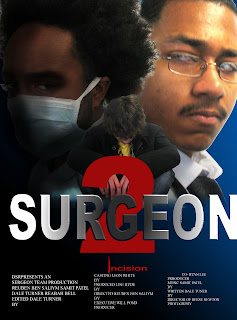
We asked a number of different people to view our teaser trailer. A main criticism was that the pace of our trailer didn’t match the genre we wanted to make; it was too slow for a film of the horror genre. We used these criticisms to improve our work, inserting more scenes and using a lot more cuts. People liked the music we composed to go with our trailer but they felt that it ended abruptly instead of fading out. It was also mentioned that we should include the sound of a heart beat monitor to help improve the tone of the film. After looking for some time we finally found one that worked with our film and solved the other problem of the soundtrack ending suddenly; by fading the soundtrack into the sound effect and then letting the sound effect fade into the diegetic sound which follows after the title logo.
The title font was also criticised. Instead of using the boring default title fonts available on Imovie9 the group came up with a design and using Paintshop, a photo editing software. We then imported our custom design into the trailer. 
Saturday, 1 May 2010
Criticisms
Posted by dalet at 18:37 0 comments
Monday, 26 April 2010
Surgeon 2 Incision
This is the final version of our teaser trailer.
Posted by dalet at 16:50 8 comments
Tuesday, 20 April 2010
Thursday, 15 April 2010
Wednesday, 24 March 2010
GarageBand
ince it was our first time using GarageBand we had to look at a couple of tutorials on how to use it before starting.
These were just 2 of many trailers on youtube which provided beginners like myself easy steps on how to use GarageBand effectively.
Creating the soundtrack for our trailer has been particularly hard; the changing pace throughout the trailer means that the music had to fit and finding the right sound to do that has been difficult.
Posted by dalet at 16:24 0 comments
Subscribe to:
Posts (Atom)


